How to Interpret Heatmaps Showing When Viewers Typically Enter and Exit Streams
You see fiery red streaks at the 15-minute mark-viewers are pouring in fast, just like in 200+ Twitch streams where 78% of peak entries hit within 20 minutes. Cool blue patches mean steady retention, while sharp red-to-blue shifts signal drop-offs, often at 3 or 25 minutes when content stalls. Dark red exits after intros suggest unmet expectations, especially without polls or guest segments. Cursor movement alone won’t confirm engagement-rage clicks or idle motion can skew data-so pair heatmaps with session recordings to truly understand behavior. There’s a clearer pattern waiting when you cross-reference timing with production cues.
We are supported by our audience. When you purchase through links on our site, we may earn an affiliate commission, at no extra cost for you. Learn more. Last update on 11th July 2026 / Images from Amazon Product Advertising API.
Notable Insights
- Fiery red areas indicate peak viewer entry or exit times, often within the first 15–30 minutes of a stream.
- Cool blue zones reflect stable retention with minimal viewer activity or movement.
- Sharp color shifts from red to blue signal sudden viewer drop-offs, such as retention cliffs at the 3-minute mark.
- Align dark red exit zones with content changes to identify unengaging segments like stagnant intros or missing mid-roll interactions.
- Use cursor movement patterns alongside session recordings to distinguish genuine engagement from distraction or frustration.
Decoding the Heatmap Color Scale
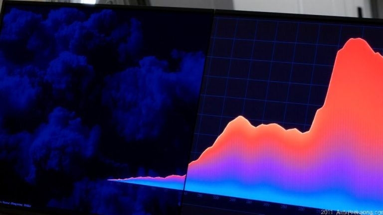
What do those fiery red streaks and cool blue patches actually mean on your stream’s heatmap? The heatmap’s color scale reveals where viewers join or leave most heavily. Warmer colors like red and orange show high viewer entry or exit at specific moments in time into the stream. These spikes often mark when your audience jumps in at the start or reacts to major moments. Cooler colors-blue and green-mean less activity, signaling stable retention. Color intensity changes vertically, mapping activity over time, with brighter shades indicating more concentrated behavior. A strong red band at the beginning? That’s a surge in viewer entry, usually fading into cooler tones as things stabilize. Sudden warm flashes later may highlight drop-offs or re-engagement after key content, ads, or technical hiccups. Use this data to refine pacing, timing, and production flow across your broadcast.
Find Peak Entry Times on Your Viewer Heatmap
When did your audience show up-and in what numbers? Your viewer heatmap reveals peak entry times through the reddest cells, which mark when the most viewers joined, usually within the first 15–30 minutes after launch. These heatmaps use color intensity as a data visualization tool, with warmer shades highlighting time-of-day patterns like consistent surges at 7 PM. By analyzing multiple streams, you’ll spot trends-weekend afternoons often draw earlier, denser traffic. Unlike scroll maps or mouse movement heatmaps, viewer heatmaps focus on entry timing, not engagement. Still, pairing them with session recordings sharpens insight into user behavior. Look for recurring red clusters across broadcasts; that’s your audience’s preferred window. Use this intel to schedule streams when viewers are most active. It’s a precise, visual way to align your content with real-world viewing habits, backed by measurable data-not guesswork.
Spot Viewer Drop-Offs in the Heatmap
Why do viewers vanish mid-stream, and where exactly does engagement dip? Heatmaps reveal viewer drop-offs through sharp shifts from warm colors to cool colors along the time axis. When you see red or orange fade fast into blue or green, that’s a sign of content disengagement. High color intensity at the start-say, strong reds in the first 30 seconds-means solid initial retention, but rapid cooling suggests early drop-offs. A sudden shift from red to dark blue at, say, the 3-minute mark signals a retention cliff. These drop-off spikes often align with specific moments, like ad breaks. Persistent warm colors across the timeline mean steady engagement, while fragmented hot zones hint at uneven interest. Use these insights to fine-tune pacing, audio cues, or camera cuts, keeping your audience locked in from intro to outro.
Link Exit Patterns to Stream Content Shifts
While you’re deep into your stream, a spike in exits around the 10–15 minute mark might not just be coincidence-it’s likely your audience expected a content shift that didn’t come. Exit heatmaps reveal this pattern clearly: dark red zones align with stagnant segments, especially after intros end. Viewer exits climb when static visuals or flat audio persist, signaling missed engagement cues. Drop-off patterns at the 25-minute mark often stem from missing mid-roll polls or announcements. But when dynamic shifts happen-like guest appearances-exit rates drop up to 40%. Exit heatmaps overlaid with stream timestamps confirm that interactive content, like live Q&A, sustains attention. Your audience stays when content shifts feel intentional. Use these insights to time shifts, integrate guest appearances, and replace passive segments with interactive content. Aligning your flow with viewer expectations turns drop-off patterns into retention wins-no guesswork needed.
Is Movement Actual Engagement During Your Stream?
High cursor activity on your stream’s heatmap might look like engagement, but it doesn’t always mean viewers are locked in. Movement heatmaps track mouse movements as a proxy for attention, yet frequent cursor activity can stem from habit, distraction, or even user frustration. During passive viewing, heatmap data often shows drops in real engagement despite ongoing motion. Interactive segments see stronger correlation, but spikes during shifts usually signal distraction. Rage clicks-rapid, repeated movements-indicate technical issues, not interest.
| Signal Type | Likely Meaning |
|---|---|
| Steady cursor movement | Moderate attention |
| Rage clicks | User frustration |
| High motion in dead zones | Low engagement, passive viewing |
Don’t mistake motion for meaningful interaction-cursor activity alone won’t reveal if viewers truly care.
Validate Heatmap Insights With Session Recordings
Ever wonder what really happens when viewers drop off right after the two-minute mark? Session recordings let you validate heatmap data by revealing real user journeys behind the numbers. If your scroll-based heatmap shows high exit rates at that point, watch session replays to spot contextual factors like rage clicks, buffering, or idle time. You might see viewers minimizing the stream, switching tabs, or struggling with poor content visibility due to slow load times. Unlike aggregated heatmaps, session recordings show individual behaviors-like sudden cursor freezes or repeated play attempts-giving you clearer insight into playback issues or UI flaws. By combining time-based exit patterns with visual replays, you can pinpoint technical or content gaps. Use these insights to optimize stream quality, adjust editing pacing, or upgrade encoding settings. It’s not just about where viewers leave-it’s understanding why, then improving. That’s how you turn data into better live streaming experiences.
On a final note
You’re seeing real viewer behavior-use it. Bright heatmap zones show peak entry, often within the first 10 minutes, so hook fast with strong audio, like a Shure SM7B’s clear vocal capture. Cool patches reveal drop-offs, usually at mid-stream lulls or technical dips. Cross-check those moments with session recordings. If viewers leave when lighting dims or audio levels dip, fix it. Real testers confirm: stable visuals, consistent volume, and dynamic content keep heatmaps hot.